
April 2026 Newsletter: Reframing
Recently, I’ve been a bit consumed by my surroundings. Everywhere I look, I find myself seeking calm to replace the chaos, order to reign in the anarchy. Am I trying to exert control over something in an insatiably noisy and uncontrolled world? Yes. Yes, I think I am.
It all started a few months ago with an overabundance of books (surprise, surprise!) that led to the construction of a new bookshelf. Over a few weekends, and after some brainstorming of space solutions in the house, my husband built a beautiful built-in bookshelf and storage area where an old junk-collecting desk used to stand. The set up of a new space was satisfying, but the purge in the transition was cathartic. Over the next few months, more projects were envisioned, more purging planned. As we unloaded a truckload of donations yesterday, my husband commented that our house feels lighter. Anything feeling lighter during these heavy days is a good thing.
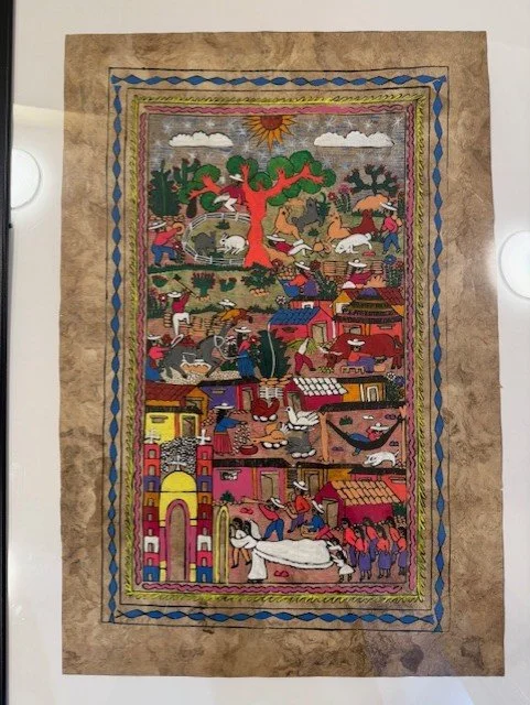
One of our projects was a renovation of our basement. For a while it’s been set up as a rec room, but with its original configuration, it wasn’t getting used. So we changed some furniture, reoriented the room, and added a new colour of paint. In that process, I was faced with a framed piece of art that I had received as a gift many years ago when I ran a family centre. The family that gave it to me were new Canadians from Mexico, and it meant a lot to me that they wanted to share their culture with me in this way. The artwork, vibrant and full of colour, is depicted in the picture above. I received it unframed, but when I wanted to display it, I decided to matte and frame it. At the time, without hesitation, I chose a shade of red to use as a matte. It seemed the most logical, the most obvious somehow. For about two decades I have not questioned the colour of that matte. Not until I glanced at it in the renovated basement, one of several pictures waiting to be rehung against a fresh coat of butter-yellow paint. Not every shade of red would look bad, but that one did.
I needed to reframe.
As I sat on the stairs looking once again at the artwork, I visualized it with a variety of matte options. Blue, like the painted border? Yellow? Green? A deeper shade of red? Every time I visualized a new matte colour, a different part of the artwork became the focus, the piece’s core. How had I never really noticed these other colours before? How had they faded into the background of a red matte, when the art is as colourfully vivid and visually engaging as it is? My blindness was eye-opening.
Over the past few months, amidst the purging and creating, I watched The Crown, a historical drama about the British royal family. Admittedly a bit late to the show (originally airing 2016-2023), I started it one day and became hooked. The show, specifically the early seasons, is filled with British historical events that I knew nothing about, and that part of it fascinated me. I learned some details about Europe after the war, about British Prime Ministers and other events that are part of historical record. However, I was also aware that the show is primarily fiction, an interpretation of history at best. For the time it took us to watch all six seasons, I had to remind myself of this on repeat. It’s easy to see only what they show you.
I became particularly conscious of this when the events in The Crown caught up with my own memories from the eighties and nineties. Princess Diana, in my opinion, was not portrayed on the show as virtuous as the world seemed to have seen her. While some scenes referred to how the public saw her, there was only minor attention paid to the work that she did in communities, the things I remember her for that made her “the people’s princess”. Suddenly, due to an interpretation of a screenwriter, this woman’s whole life, her whole value as a person was reframed. Not negatively per say, but not as positive as I’d always believed. Things shifted in my perspective almost without my permission. The matte around my image of Princess Diana had always been red, and now I could only see blue. It takes effort to transform that into purple.
If that was true about Princess Diana, what about everyone else? Queen Elizabeth and Prince Philip? Princess Margaret? The Queen Mother? And of course all the royal children? I have no memories of any of these historical figures in their early years, before I was born or before I was aware of the state of the world. The matte the show offered for the fifties, sixties, and seventies was the only one I had. It would be easy to believe that the colour they used was accurate, the picture complete and straightforward. But life is never that simple. It was, again, up to me to smudge the colours, to add the shades of gray that make for something at least closer to the truth. It was up to me to put in that effort.
I’ve just recently finished a creative non-fiction piece about perspective. It is part mini-memoir, part reflection on what it means to interpret someone else’s story, and how it integrates itself into our own identities, our own perspectives. It’s been submitted to a journal for consideration, so I won’t speak to the details, but I will offer this quote:
My experience of other people’s pain and regret really only exists in my imagination, my viewpoint as an outsider. When I say I remember, it is simply one thread of memory tangled into a larger knot of communal recollection; perspective and empathy and anger and excuse adding colour and dimension to facts, for better or worse.
We matte our own stories with the colours that speak to us, and other people’s stories too, just as they matte ours. In this world of misinformation and algorithms and echo chambers and polarization, I hope we can all remember to put the effort in to search for the other colours, the other shades that make the picture vibrant and real and colourful. It’s not only good, it’s essential.
In the end, I didn’t really matte my piece of Mexican artwork. I lay it on top of a white matte instead of behind it, allowing not only the colours to show, but even its rough edges.
And it’s perfect.
Fault Lines book news is still pending, but hope to have some updates for you next time! Hope you have a wonderful spring season filled with books and sunshine!